You are using an out of date browser. It may not display this or other websites correctly.
You should upgrade or use an alternative browser.
You should upgrade or use an alternative browser.
Opinion on Decals
- Thread starter blackheart
- Start date
Street Wolf
Banned
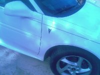
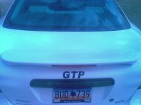
Fail, take them off. You already have a arrow head on the front and a GTP emblem on the back.
")
blackheart
New member
ok i'm gonna take the back one off, i kind of doubted that one myself. the front two i like.
Nickell
New member
this is the only decal i have done so far, and probably the only one i will do.
http://www.facebook.com/photo.php?pid=30186706&id=1182270208#/photo.php?pid=30186705&id=1182270208
http://www.facebook.com/photo.php?pid=30186706&id=1182270208#/photo.php?pid=30186705&id=1182270208
Reflective Concepts
New member
The arrowheads wouldn't be so noticeable if they were on the very lower part of that fender (not up so high). They wouldn't be so much in your view.
The GTP isn't the right font, so it just looks out of place. I think if you had the correct font there and smaller, it would blend more.
Decals can be great if you can get them to blend and go with a scheme.
The GTP isn't the right font, so it just looks out of place. I think if you had the correct font there and smaller, it would blend more.
Decals can be great if you can get them to blend and go with a scheme.
Injun #4
New member
The arrowheads wouldn't be so noticeable if they were on the very lower part of that fender (not up so high). They wouldn't be so much in your view.
The GTP isn't the right font, so it just looks out of place. I think if you had the correct font there and smaller, it would blend more.
Decals can be great if you can get them to blend and go with a scheme.
x2
I wouldn't go higher than the door moldings with the arrowheads. And if you used the proper font, the "GTP" might look good if it was the body color and placed between the reverse lights.
T
TDCRacing
Guest
I think the ones on the fender would also look better if they were lower.
blackheart
New member
ok i took the trunk one off.