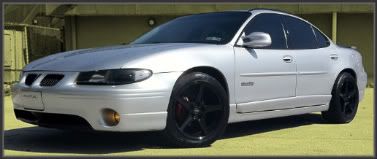
Thread: What the limited edition interior should of looked like..

Results 1 to 11 of 11
  1. #1 What the limited edition interior should of looked like.. 
    GXP Level Member rocafella2032's Avatar
    Join Date
    Mar 2009
    Location
    Norristown, PA
    Posts
    2,606
    Thanks (Received)
    0
    Likes (Received)
    0
    Dislikes (Received)
    0
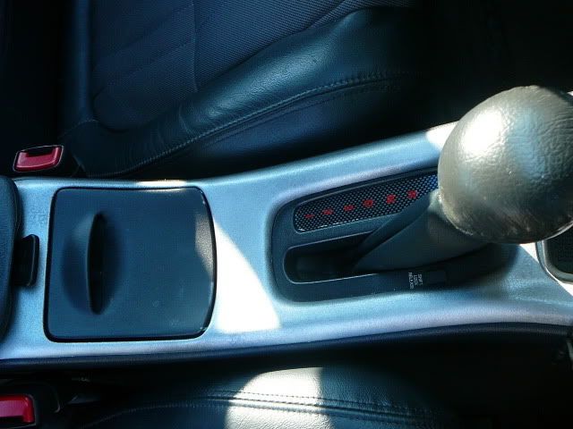
    Well, being everything on my limited edition came graphit/silver they still left the dash graphite, actually most of the interior..

    i decided to spice it up more limited edition style...


    Reply With Quote  
     

  2. #2 Re: What the limited edition interior should of looked like.. 
    The mod from over yonder TheOtherNick's Avatar
    Join Date
    Sep 2008
    Location
    Charles City, IA
    Posts
    9,955
    Thanks (Received)
    0
    Likes (Received)
    0
    Dislikes (Received)
    0
    Looks good. Pays off to take your time when you paint ****.
    01 gtp-big cam e85 dd 78dodge- guzzling fuel 05 cummins- rollin coal
    SMGPFC Two Nipple General
    Reply With Quote  
     

  3. #3 Re: What the limited edition interior should of looked like.. 
    GXP Level Member rocafella2032's Avatar
    Join Date
    Mar 2009
    Location
    Norristown, PA
    Posts
    2,606
    Thanks (Received)
    0
    Likes (Received)
    0
    Dislikes (Received)
    0
    thanks man..and for helping me get that SOB out
    Reply With Quote  
     

  4. #4 Re: What the limited edition interior should of looked like.. 
    GrandPrix Junkie SeanGTP's Avatar
    Join Date
    Nov 2008
    Location
    Waterloo, Iowa
    Posts
    4,168
    Thanks (Received)
    0
    Likes (Received)
    0
    Dislikes (Received)
    0
    You should paint the cupholders too. Maybe not the inside, but the outside for sure. Also the coin tray, and if you can get it out the ashtray? I know that's pushing it, but I do think it'd look that much better.
    Reply With Quote  
     

  5. #5 Re: What the limited edition interior should of looked like.. 
    GT Level Member putskijr's Avatar
    Join Date
    Aug 2009
    Location
    Waterloo, Iowa
    Posts
    253
    Thanks (Received)
    0
    Likes (Received)
    0
    Dislikes (Received)
    0
    I painted my interior except I did he opposite of u. I did all the vents, cupholder, Window switches, and shifter piece. Looks sweeeeeet. Not too much standing out
    Reply With Quote  
     

  6. #6 Re: What the limited edition interior should of looked like.. 
    GXP Level Member rocafella2032's Avatar
    Join Date
    Mar 2009
    Location
    Norristown, PA
    Posts
    2,606
    Thanks (Received)
    0
    Likes (Received)
    0
    Dislikes (Received)
    0
    i like the contrast of the the gray and silver, if i did all you mentioned it would be to much
    Reply With Quote  
     

  7. #7 Re: What the limited edition interior should of looked like.. 
    GXP Level Member boosting98's Avatar
    Join Date
    Mar 2008
    Location
    Wisconsin
    Posts
    2,995
    Thanks (Received)
    0
    Likes (Received)
    0
    Dislikes (Received)
    0
    where did u get the c/f gear indicator thing?
    Reply With Quote  
     

  8. #8 Re: What the limited edition interior should of looked like.. 
    GXP Level Member rocafella2032's Avatar
    Join Date
    Mar 2009
    Location
    Norristown, PA
    Posts
    2,606
    Thanks (Received)
    0
    Likes (Received)
    0
    Dislikes (Received)
    0
    I worked with Talia from houseofgrafx on it. Should be on her site. As well as a c/f fog light switch.
    Reply With Quote  
     

  9. #9 Re: What the limited edition interior should of looked like.. 
    Donating Users blkgp2000's Avatar
    Join Date
    Nov 2008
    Location
    IL
    Posts
    86
    Thanks (Received)
    0
    Likes (Received)
    0
    Dislikes (Received)
    0
    Quote Originally Posted by rocafella2032 View Post
    i like the contrast of the the gray and silver, if i did all you mentioned it would be to much
    I like the contrast too. It looks really good. Great job!


    ASCD SD Ram Air Hood, SLP CAI Kit, A-Pillar Gauge Pod, Oil Pressure Gauge and Voltmeter from Autometer, GMPP F/R STB with Don Rome Brackets, GMPP F/R Sway Bars, UMI Trailing Arms
    Reply With Quote  
     

  10. #10 Re: What the limited edition interior should of looked like.. 
    I troll naked Thunderturd's Avatar
    Join Date
    Apr 2009
    Location
    Wausau, Wisconsin
    Posts
    1,441
    Thanks (Received)
    0
    Likes (Received)
    0
    Dislikes (Received)
    0
    Looks great, Might do it myself.
    Quote Originally Posted by Bio248 View Post
    yeah, clearly none of us have lives. it's a shame we have no time to work on our cars or bang chicks or do drugs.
    Reply With Quote  
     

  11. #11 Re: What the limited edition interior should of looked like.. 
    GXP Level Member rocafella2032's Avatar
    Join Date
    Mar 2009
    Location
    Norristown, PA
    Posts
    2,606
    Thanks (Received)
    0
    Likes (Received)
    0
    Dislikes (Received)
    0
    i recomend doing it! it makes the interior look so much better
    Reply With Quote  
     

Similar Threads

  1. Limited Edition Spoiler
    By FoSHO99 in forum Visual/Body Modifications
    Replies: 18
    Last Post: 04-13-2013, 01:37 PM
  2. limited edition gauges
    By sasquatch094 in forum General Tech Discussion
    Replies: 2
    Last Post: 08-27-2009, 05:53 PM
  3. Limited Edition spoiler is on
    By Berger in forum Visual/Body Modifications
    Replies: 21
    Last Post: 12-16-2008, 03:11 PM
Tags for this Thread

View Tag Cloud

Bookmarks
Bookmarks
Posting Permissions
  • You may not post new threads
  • You may not post replies
  • You may not post attachments
  • You may not edit your posts
  •